Click on the tag to go the tutorial -
Showing posts with label tut. Show all posts
Saturday, October 2, 2010
Monica's Magic Tutorial
Mary from Country Bug Tutorials has another fantastic tutorial using one of my kits up. This one uses my part of the It's A Kind Of Magic Collab from September. The kit is still available HERE.
Tuesday, February 2, 2010
Love Letters Tutorial
Mary from Country Bug Tutorials has done a fantastic tag tut using my new Love Letters kit. Click on the tag to go check out the tut.
Friday, December 11, 2009
New Kit In Stores
I have a new Christmas kit in all my stores -

The kit is available in Full size Commercial Use OK (ie you can use it for Scrap 4 Hire, quick pages etc) and a Personal Use Taggers size. Click on a blinkie in the side menu if you would like to check it out.
Mary from Country Bug Tutorials has written a tut with it, click on the link if you would like to try the tut out.


The kit is available in Full size Commercial Use OK (ie you can use it for Scrap 4 Hire, quick pages etc) and a Personal Use Taggers size. Click on a blinkie in the side menu if you would like to check it out.
Mary from Country Bug Tutorials has written a tut with it, click on the link if you would like to try the tut out.

Thursday, January 1, 2009
Making A Blog Layout
Sandy asked for tips on making blog layouts. This is how I do mine (in PSPX) -
BLOG LAYOUT TEMPLATE
1. Open a new image 1500 x 1200 with a transparent background. I make it this big so it can cope with all the various screen resolutions and widescreen monitors.
2. Open another new image 1024 x 1200 with a black background. In the top left corner add text 1024 and merge. Copy and paste this to your first image as a new layer.
3. Open another new image 800* x 1200 with a white background. Copy and paste to your first image as a new layer.
* This is the layer your text will be on and the width is determined by the widths of your main wrapper and the any side bars. I made my main wrapper wider than the standard for my scrap previews. To change this figure you need to look through the html and find this -

4. Save this template to use for your blog layouts.
To use the template -
Duplicate and close the original.
Floodfill the transparent layer with a scrap paper of your choice (small papers may need to be made seamless first).
The black layer with 1024 represents the screen resolution 1024 x 768 which according to my Bravenet stats is currently the most common resolution used. It is there as a guide for placing decorations on your layout. This layer will be deleted when your layout is finished.
The white layer is what your text will sit on but you can make it any colour you like. I generally keep mine white because it is easier to read plus most of my tags are done on a white background.
Use embellishments from your scrap kit to decorate the sides where the white meets the paper, taking care not to go outside the black 1024 guide. Do not impose too much on the white layer or you will be covering text. Don't forget to delete the black layer. Merge as a single layer and check the size. If you are using Photobucket to host your layouts your layout must be under 1MB or it will be automatically resized.
Make a matching blog header 660 x 120 with a background to match your white and using matching embellishments from the scrap kit.
Installing Your Layout
For tips on how to install your layout visit Lisa's blog and click on the label Layout Installation Tips and start reading from the bottom up. Thanks Lisa for providing great tips for customizing blogs.
BLOG LAYOUT TEMPLATE
1. Open a new image 1500 x 1200 with a transparent background. I make it this big so it can cope with all the various screen resolutions and widescreen monitors.
2. Open another new image 1024 x 1200 with a black background. In the top left corner add text 1024 and merge. Copy and paste this to your first image as a new layer.
3. Open another new image 800* x 1200 with a white background. Copy and paste to your first image as a new layer.
* This is the layer your text will be on and the width is determined by the widths of your main wrapper and the any side bars. I made my main wrapper wider than the standard for my scrap previews. To change this figure you need to look through the html and find this -

4. Save this template to use for your blog layouts.
To use the template -
Duplicate and close the original.
Floodfill the transparent layer with a scrap paper of your choice (small papers may need to be made seamless first).
The black layer with 1024 represents the screen resolution 1024 x 768 which according to my Bravenet stats is currently the most common resolution used. It is there as a guide for placing decorations on your layout. This layer will be deleted when your layout is finished.
The white layer is what your text will sit on but you can make it any colour you like. I generally keep mine white because it is easier to read plus most of my tags are done on a white background.
Use embellishments from your scrap kit to decorate the sides where the white meets the paper, taking care not to go outside the black 1024 guide. Do not impose too much on the white layer or you will be covering text. Don't forget to delete the black layer. Merge as a single layer and check the size. If you are using Photobucket to host your layouts your layout must be under 1MB or it will be automatically resized.
Make a matching blog header 660 x 120 with a background to match your white and using matching embellishments from the scrap kit.
Installing Your Layout
For tips on how to install your layout visit Lisa's blog and click on the label Layout Installation Tips and start reading from the bottom up. Thanks Lisa for providing great tips for customizing blogs.
Friday, November 28, 2008
Making Paper Rolls For Previews
This is how I do the paper rolls.
You Will Need:
MuRa's Seamless Stripe of Cylinder Filter HERE.
1. Create a new canvas and copy each of your papers to it as a new layer.
2. Apply the Stripe of Cylinder filter to each paper layer at default settings but change the number to the number of papers you have.

3. Use your selection tool to select the parts of each layer that you don't want and delete. I do it this way because you may want to pick and choose which parts of the patterned papers are displayed in your preview. Alternatively you can just move your layers across so that each paper shows. Once you are satisfied with your papers, merge.
You Will Need:
MuRa's Seamless Stripe of Cylinder Filter HERE.
1. Create a new canvas and copy each of your papers to it as a new layer.
2. Apply the Stripe of Cylinder filter to each paper layer at default settings but change the number to the number of papers you have.

3. Use your selection tool to select the parts of each layer that you don't want and delete. I do it this way because you may want to pick and choose which parts of the patterned papers are displayed in your preview. Alternatively you can just move your layers across so that each paper shows. Once you are satisfied with your papers, merge.
Friday, November 14, 2008
Sunday, September 21, 2008
Make Your Own Christmas Tinsel
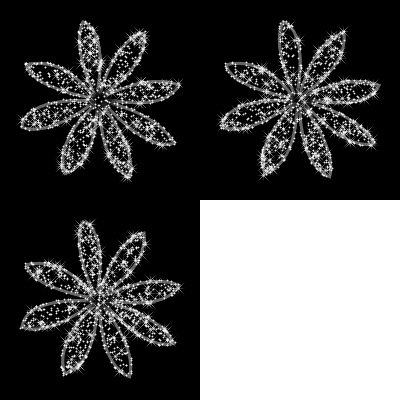
I was starting to put some things together for a Christmas kit (as you do in September lol) and I stumbled across a really good tinsel effect which I thought I would share with you -
YOU WILL NEED:
PSP (any version should be fine)
glitter tiles
Shawna's Fuzzy Fiber brushes
LETS START
1. Go and do Shawna's Fuzzy Fibers tut HERE. A big thank you to Shawna for all the wonderful tuts too!
2. Open the glitter tiles you want to use in PSP. Set a coloured glitter tile as the foreground and a silver glitter tile as the background (you will find a pack of free CU glitter tiles here if you don't have any). Scale both the foreground and the background to 50%.
3. I used Shawna's brush 2, size 30 but experiment with the different brushes to find an effect you like. Draw/paint your tinsel.
4. Sharpen your tinsel, Adjust menu - Sharpness - Unsharp Mask - Radius 1.03, Strength 40, Clipping 1, Luminance ticked.
You should end up with something that looks like this -

You can add some extra sparkle with Xenofex Constellation or VM Natural. Very Christmassy don't you think?
YOU WILL NEED:
PSP (any version should be fine)
glitter tiles
Shawna's Fuzzy Fiber brushes
LETS START
1. Go and do Shawna's Fuzzy Fibers tut HERE. A big thank you to Shawna for all the wonderful tuts too!
2. Open the glitter tiles you want to use in PSP. Set a coloured glitter tile as the foreground and a silver glitter tile as the background (you will find a pack of free CU glitter tiles here if you don't have any). Scale both the foreground and the background to 50%.
3. I used Shawna's brush 2, size 30 but experiment with the different brushes to find an effect you like. Draw/paint your tinsel.
4. Sharpen your tinsel, Adjust menu - Sharpness - Unsharp Mask - Radius 1.03, Strength 40, Clipping 1, Luminance ticked.
You should end up with something that looks like this -

You can add some extra sparkle with Xenofex Constellation or VM Natural. Very Christmassy don't you think?
Wednesday, September 10, 2008
Radiance Sig Tag Tut
I have a new tutorial up using the Yesterday, Today and Tomorrow kit. Hope you like it.
Click on the tag to go to the tut
Monday, August 25, 2008
Making Your Own Textured Overlays
This technique is mostly used for making scrap papers.
YOU WILL NEED:
* Paint Shop Pro (I use PSPX but you should be able to do this in all versions)
* Digital camera
LETS START:
1. Take your camera and go for a walk around your house, inside and out. Take photographs of any interesting textures you come across eg dirty concrete, wooden fence, rock face, gravel, grass, sand, fruit skins, close ups on leaves or flowers.
2. Load your photographs to your computer. Open the photograph you want to use in PSP.
3. Take a critical look at the photo and decide if you want to use the whole photograph for your texture or just a portion of it. At this point, crop or resize your photo to a size suitable for your project.
4. I like to make my textures seamless if possible as this gives you a little more flexibility in the size you can use as you can use it as a pattern fill. There are many free filters out there that you can use to seamless tile but I prefer to use the one that comes with PSP. Effects menu - Image Effects - Seamless Tiling. Adjust the settings and try the different options until you get a result you are happy with.
5. To apply your texture you paste your photo as a new layer above what you want textured. Change the layer blend mode (on the layer palette) to find a setting you are happy with. I use hard light or overlay the most.
TIPS
* If you don't want the whole layer textured, make sure you select the part that you do want textured first and delete the excess from the overlay layer.
* You can change the layer opacity if you feel the texture is too heavy.
* Use Adjust Brightness and Contrast on either your overlay or bottom layer to brighten or darken your result.
* Apply different filters to overlays for different effects.
* Use two overlays for different effects.
* Scan rather than photograph swatches of material or other small items.
YOU WILL NEED:
* Paint Shop Pro (I use PSPX but you should be able to do this in all versions)
* Digital camera
LETS START:
1. Take your camera and go for a walk around your house, inside and out. Take photographs of any interesting textures you come across eg dirty concrete, wooden fence, rock face, gravel, grass, sand, fruit skins, close ups on leaves or flowers.
2. Load your photographs to your computer. Open the photograph you want to use in PSP.
3. Take a critical look at the photo and decide if you want to use the whole photograph for your texture or just a portion of it. At this point, crop or resize your photo to a size suitable for your project.
4. I like to make my textures seamless if possible as this gives you a little more flexibility in the size you can use as you can use it as a pattern fill. There are many free filters out there that you can use to seamless tile but I prefer to use the one that comes with PSP. Effects menu - Image Effects - Seamless Tiling. Adjust the settings and try the different options until you get a result you are happy with.
5. To apply your texture you paste your photo as a new layer above what you want textured. Change the layer blend mode (on the layer palette) to find a setting you are happy with. I use hard light or overlay the most.
TIPS
* If you don't want the whole layer textured, make sure you select the part that you do want textured first and delete the excess from the overlay layer.
* You can change the layer opacity if you feel the texture is too heavy.
* Use Adjust Brightness and Contrast on either your overlay or bottom layer to brighten or darken your result.
* Apply different filters to overlays for different effects.
* Use two overlays for different effects.
* Scan rather than photograph swatches of material or other small items.
Monday, August 18, 2008
Tuesday, August 5, 2008
Monday, August 4, 2008
Making Ribbons In Paint Shop Pro

This is how I make ribbons in PSP.
YOU WILL NEED:
* Paint Shop Pro (I use PSPX and am not sure if the warp brush is available in earlier versions)
* Greg's Factory Filters (free) from HERE (scroll down).
LETS START:
1. Open a new canvas 1000 x 500 pixels with a white background. Add a new raster layer.
2. With your selection tool set on rectangle and feather on 0, draw out a rectangle the size you want your ribbon to be.
3. Floodfill on new raster layer with the colour or pattern of choice. DO NOT deselect.
4. Apply Pool Shadow at the settings given below. You can adjust the intensity and lightness for stronger or weaker effect.

5. Effects Menu - Texture Effects - Texture - use the settings below

6. Selections - Modify - Contract by 2 or 3 (depending on size of your ribbon) - Invert.
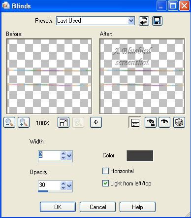
7. Effects Menu - Texture Effects - Blinds - use settings below. You can change the colour according to the colour of your ribbon and whether you want a darker or lighter effect.

8. Select none. Trim the edges of the ribbon (use your selection tool on rectangle to select then press delete) to remove the blinds effect from the ends.
9. To give your ribbon a less straight look, run your Warp Brush gently along the edges using the settings below. Click on the green apply tick when you are finished warping.


Your ribbon is finished. I hope you enjoyed this tutorial.
Monday, July 28, 2008
Thursday, July 17, 2008
Bow Tutorial and Commercial Use Freebies
HOW TO MAKE A BOW
There are lots of ways to get to the same result. This is how I make digital bows for my scrap kits and it involves real ribbon lol.
You will need:
* ribbon to tie a bow with
* scanner/digital camera
* a good knowledge of PSP (or graphics program of choice, I use PSPX)
* a patterned scrap paper of choice
Lets Start:
1. Take a length of ribbon and make a bow. If you google how to tie a bow, you will find instructions for tying some fancy bows too.
2. Scan or photograph your bow (I usually scan) transfer to your computer and open the file in PSP.
3. Duplicate your bow and add a new raster layer between the two bow layers. Floodfill the new layers with #0000ff. Duplicating the bow is optional but the blue layer isn't. I duplicate the bow in case I make a mistake and cut too much off. This way I can easily cut and paste bits back rather than start all over again.
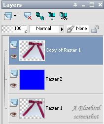
Make sure you are on the top layer. Zoom in on your bow so you can clearly see the edge - about 200- 300% depending on the size. Using your freehand selection tool on the following settings, carefully trace around the outside of edge of your bow. Right click to close the selection. Selections - Invert - press the delete key twice.

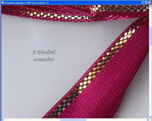
4. Click on the blue layer and floodfill with different colours to make sure you have removed enough of the background. If there are any little blemishes on your bow, you can tidy them up with your clone tool. Keep the brush size to about the size of the blemish.
5. Once you are satisfied with your bow, delete the blue layer and the original layer.
6. I make all my bows greyscale so I can use them in different kits (and inevitably, the colour is not right for the kit I'm doing anyway lol). Adjust menu - Hue and Saturation - Colorize. It doesn't matter what the hue is as long as saturation is on zero.
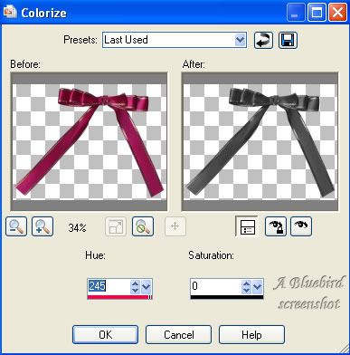
7. If the colour of your ribbon is too light or too dark, Adjust menu - Brightness and Contrast - Brightness/Contrast. Positive numbers for brighter, negative for darker in the Brightness. I usually keep the Contrast at about 10.
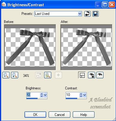
8. You may want to resize and sharpen (not too much) your bow at this point. Save your file and your bow is ready for use. Just colorize to match your kits. But how do you make patterned bows to match papers I hear you ask?
9. Shift + D to duplicate your bow file and close the original file. Duplicate the bow layer so that you have two. Close the top layer off and make sure the bottom layer is active. On your Materials Palette, make the foreground your patterned paper and the background colour the grey of your bow. You will need to scale the pattern down so the detail is not lost on the bows and how much you scale will depend on the size of the paper you use.
10. Use your colour replacer tool at the following settings and click on your bow. If you are not getting good coverage increase the tolerance. Click on the blue icon to colour all pixels on that layer.

11. You will notice that colouring this way does not give any definition to your bow. Activate your top bow layer and make it visible. Change the blend mode to hard light. To make the colour of your bow closer to your paper you can adjust brightness and contrast on the patterned layer and you can also lower the opacity of the top layer. Once satisfied with the colouring and definition of your bow, merge visible, save and you are done.
These two bows were coloured using one of the papers from the Bright and Beautiful Add On scaled to 60%. The overlay layer was at 70% (80% for second example) and the bottom layer had the Brightness and Contrast adjusted at the settings given above.

I hope you have enjoyed this tutorial.
Now for the freebie -
I have a couple of tagger sized commercial use ok bows for you to practise colouring. Commercial TOU are under my usual Terms of Use.

DOWNLOAD HERE
There are lots of ways to get to the same result. This is how I make digital bows for my scrap kits and it involves real ribbon lol.
You will need:
* ribbon to tie a bow with
* scanner/digital camera
* a good knowledge of PSP (or graphics program of choice, I use PSPX)
* a patterned scrap paper of choice
Lets Start:
1. Take a length of ribbon and make a bow. If you google how to tie a bow, you will find instructions for tying some fancy bows too.
2. Scan or photograph your bow (I usually scan) transfer to your computer and open the file in PSP.
3. Duplicate your bow and add a new raster layer between the two bow layers. Floodfill the new layers with #0000ff. Duplicating the bow is optional but the blue layer isn't. I duplicate the bow in case I make a mistake and cut too much off. This way I can easily cut and paste bits back rather than start all over again.

Make sure you are on the top layer. Zoom in on your bow so you can clearly see the edge - about 200- 300% depending on the size. Using your freehand selection tool on the following settings, carefully trace around the outside of edge of your bow. Right click to close the selection. Selections - Invert - press the delete key twice.


4. Click on the blue layer and floodfill with different colours to make sure you have removed enough of the background. If there are any little blemishes on your bow, you can tidy them up with your clone tool. Keep the brush size to about the size of the blemish.
5. Once you are satisfied with your bow, delete the blue layer and the original layer.
6. I make all my bows greyscale so I can use them in different kits (and inevitably, the colour is not right for the kit I'm doing anyway lol). Adjust menu - Hue and Saturation - Colorize. It doesn't matter what the hue is as long as saturation is on zero.

7. If the colour of your ribbon is too light or too dark, Adjust menu - Brightness and Contrast - Brightness/Contrast. Positive numbers for brighter, negative for darker in the Brightness. I usually keep the Contrast at about 10.

8. You may want to resize and sharpen (not too much) your bow at this point. Save your file and your bow is ready for use. Just colorize to match your kits. But how do you make patterned bows to match papers I hear you ask?
9. Shift + D to duplicate your bow file and close the original file. Duplicate the bow layer so that you have two. Close the top layer off and make sure the bottom layer is active. On your Materials Palette, make the foreground your patterned paper and the background colour the grey of your bow. You will need to scale the pattern down so the detail is not lost on the bows and how much you scale will depend on the size of the paper you use.
10. Use your colour replacer tool at the following settings and click on your bow. If you are not getting good coverage increase the tolerance. Click on the blue icon to colour all pixels on that layer.

11. You will notice that colouring this way does not give any definition to your bow. Activate your top bow layer and make it visible. Change the blend mode to hard light. To make the colour of your bow closer to your paper you can adjust brightness and contrast on the patterned layer and you can also lower the opacity of the top layer. Once satisfied with the colouring and definition of your bow, merge visible, save and you are done.
These two bows were coloured using one of the papers from the Bright and Beautiful Add On scaled to 60%. The overlay layer was at 70% (80% for second example) and the bottom layer had the Brightness and Contrast adjusted at the settings given above.

I hope you have enjoyed this tutorial.
Now for the freebie -
I have a couple of tagger sized commercial use ok bows for you to practise colouring. Commercial TOU are under my usual Terms of Use.

DOWNLOAD HERE
Thursday, July 3, 2008
Pastels Sig Tag Tut
Again a big thanks to everyone who has left a comment either here or on my 4shared. It's great to read them 
Click on the tag for the sig tag tut using the Pretty Pastels kit -
Thursday, June 26, 2008
Bling Bling
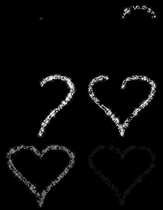
Some bling animations I made and thought I would share here. These are all in .psp format and can be opened in PSP or Animation Shop.
HOW TO COLOUR YOUR BLING IN PSP
1. Duplicate your bling tube and close the original. Activate your Colour Replacer Tool.
2. Set the foreground on your Materials Palette to the colour/gradient/pattern you want for your bling and the background on the colour to be replaced ie white.
3. Activate one of the layers of your bling tube and click on the bling which should then change colour. Adjust your tolerance if you are not getting good coverage. In your toolbar you will see an icon for replace all pixels. Click on this and all white pixels will be replaced on that layer.
4. Repeat for all layers of your bling.
5. Delete the background and copyright layers (if you haven't already) and you are good to go.

DOWNLOAD HERE

DOWNLOAD HERE

DOWNLOAD HERE

DOWNLOAD HERE
HOW TO COLOUR YOUR BLING IN PSP
1. Duplicate your bling tube and close the original. Activate your Colour Replacer Tool.
2. Set the foreground on your Materials Palette to the colour/gradient/pattern you want for your bling and the background on the colour to be replaced ie white.
3. Activate one of the layers of your bling tube and click on the bling which should then change colour. Adjust your tolerance if you are not getting good coverage. In your toolbar you will see an icon for replace all pixels. Click on this and all white pixels will be replaced on that layer.
4. Repeat for all layers of your bling.
5. Delete the background and copyright layers (if you haven't already) and you are good to go.

DOWNLOAD HERE

DOWNLOAD HERE

DOWNLOAD HERE
DOWNLOAD HERE
Tuesday, June 24, 2008
Rock and Roll Sig Tag Tut
I'd like to thank everyone who has left comments here or on my 4shared links for the various scrapkits. It is a real boost to read them and know that people are enjoying the things I make.
I have done a tag tutorial using the Rock and Roll scrapkit. Click on the tag to see the tut.
Tuesday, June 10, 2008
Friday, May 23, 2008
Signature Tag Tutorial
I have written a Signature Tag tutorial using the It's So Blue scrapkit. Click on the tag to go to the tut.

While writing the tutorial I discovered that one of the glitter tiles was saved in psp format. I have fixed the zip but if you have already downloaded the kit, the tile is here in jpeg format - just right click and save.

While writing the tutorial I discovered that one of the glitter tiles was saved in psp format. I have fixed the zip but if you have already downloaded the kit, the tile is here in jpeg format - just right click and save.
Thursday, May 8, 2008
Sweet Violet Scrapkit
Subscribe to:
Posts (Atom)